Why Gray?
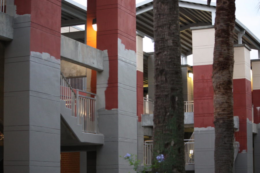
Photo provided by: Julia Moon
The courtyard staircases in front of Buildings Six and Seven in the process of being repainted on Sep. 16th, 2019
October 17, 2019
Most students describe their high school experience as boring, exhausting or even soul crushing, but generally those feelings are not reflected in their surroundings. Unfortunately, we can no longer say the same about our campus. In fact our new gray paint embodies the soul crushing spirit students describe, as it resembles a form of education that would be seen in a dull dystopian movie.
Even though the gray paint seemed half-planned, it was part of a four phase construction process, including changes to the fire alarms, exterior pressure washing, and the new building five. Principal Brian Blasewitz, even suggested that they change the color of the paint, however, plans were already set into motion by his predecessor.
It is already bothersome that the infrastructure design is painfully similar to a jail, but adding a lifeless color, generally associated with monotony is even worse. The administration staff seems to be doing everything in their power to make students’ negative perception of school a reality. It is astonishing that both Building Five and the new cafeteria resembles the modern architecture that the administration seemed to be going for, yet the paint resembles the inside of a prison cell.
Before the campus-wide paintings, students arose from their sleep-deprived state to a reasonably lively atmosphere or at least one that did not make their exhaustion level ten times higher. The main issue with the paint has little to do with the opinion of the student body. It is not like they can just decide not to come to school, at least not without receiving a heavy truancy fine. The problem is that it is not aesthetically pleasing; it is just plain ugly.
As of right now, none of the buildings are finished, so the entire school looks like an elementary school child who dressed themselves for the first time. There has to be a better color to match to our school’s primary hue of red. At a minimum, the shade chosen could have resembled Brantely’s colors, so students can exude the spirit faculty members encourage. Maybe if our school was painted using red, white or dark blue students would feel less solemn when they arrive at campus.
While I understand the red paint we had prior to this horrid development was beginning to fade, I struggle to understand why gray was the best alternative. There are a multitude of other plausible options that would uplift the campus atmosphere, but gray is not one of them. The fact of the matter is the gray paint only adds negative attributes to our campus and the changes should not have been made.